Better UI/UX Design: Lessons I've Learned Building Day Marker
10 MIN READ · BY Mortuz Alam
Table of Contents
- 1. The hardest interface to design is often the simplest one
- 2. Designing for a daily ritual is different from designing for an occasional task
- 3. A missed day shouldn't feel like failure
- 4. Empty states are part of the product—not placeholders
- 5. Good UX often means resisting perfectly reasonable ideas
- 6. Consistency matters more than decoration
- 7. Designing mobile interfaces means designing for interruptions
- 8. The interface should respect the user's time
- 9. Real products are messier than design files
- 10. You have to design for the person who doesn't think like you
- 11. Sometimes the best product decision is philosophical
- 12. The biggest lesson: simple doesn't mean easy
- What Day Marker changed in the way I design
There is a particular kind of trap that designers fall into when building something for themselves.
You start with a simple idea.
Then you improve it.
Then you add one more thing.
Then another.
Before long, the simple idea has become a complicated product trying to solve problems nobody originally asked it to solve.
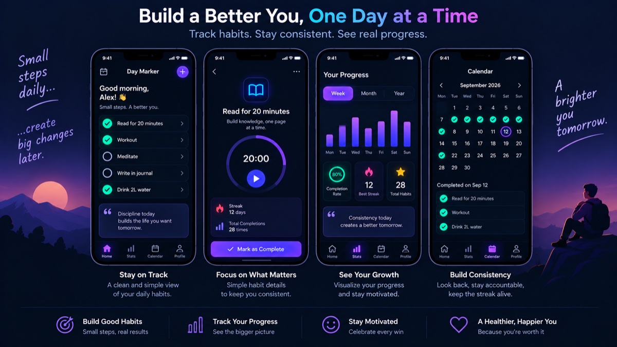
I learned this while designing Day Marker, a habit-tracking app built around a very simple idea:
Mark the things that matter today.
It sounds easy.
Designing it wasn't.
Day Marker taught me more about product design than many of the projects I had worked on before—not because it was technically complicated, but because it forced me to confront something designers often forget:
simplicity is not the absence of design.
It is the result of design.
1. The hardest interface to design is often the simplest one
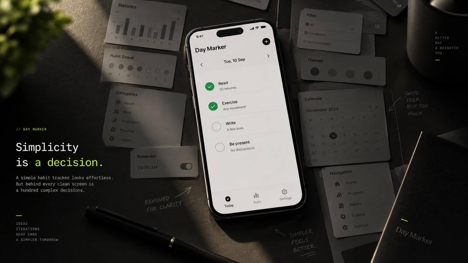
When you have an empty canvas, adding things is easy.
A button here.
A card there.
A statistic.
A progress indicator.
A settings page.
A filter.
A dashboard.
Everything seems reasonable individually.
The problem appears when you put everything together.
Suddenly the user has to look before they can act.
That became one of my earliest lessons with Day Marker.
A habit tracker doesn't need to explain itself.
You shouldn't have to study the interface to understand whether you've completed something today.
You shouldn't have to navigate through several screens just to mark a habit.
The interface should almost disappear.
The user should see their day and immediately know what to do.
That sounds obvious, but achieving it requires constantly asking:
"Does this help the user, or does it simply make the interface more interesting?"
Those are very different things.
2. Designing for a daily ritual is different from designing for an occasional task
Most apps are opened when the user needs something.
A banking app is opened because you want to check your balance.
A food delivery app is opened because you're hungry.
A map is opened because you need somewhere to go.
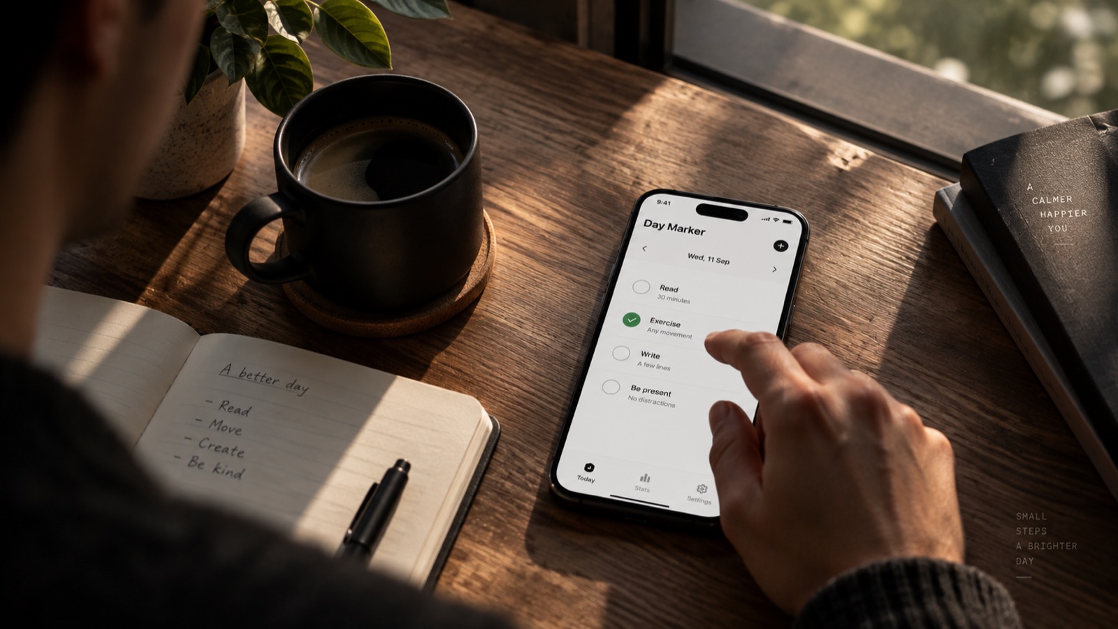
A habit tracker is different.
You open it because you're trying to become someone different.
That makes the interaction surprisingly emotional.
The user isn't just checking a box.
They're asking themselves:
Did I keep my promise to myself today?
That changed how I thought about the interface.
Every interaction needed to feel lightweight.
No unnecessary friction.
No feeling of being punished for missing yesterday.
No overwhelming statistics telling you how badly you're doing.
Just today.
One day at a time.
3. A missed day shouldn't feel like failure
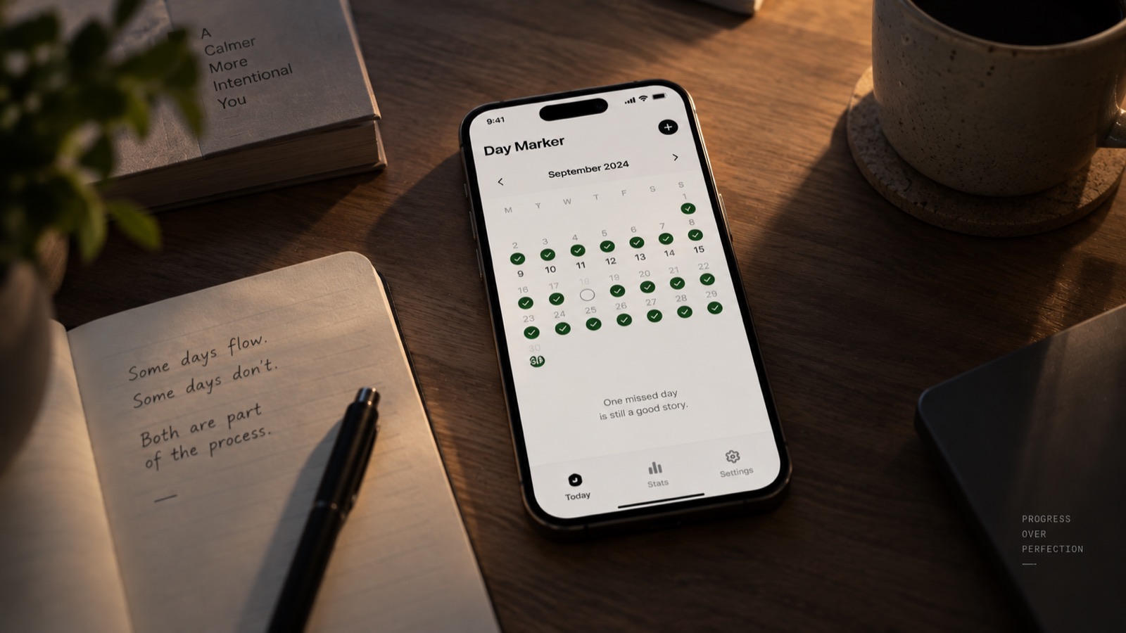
This was probably one of the most important things I learned.
Habit products often talk about streaks.
Seven days.
Thirty days.
One hundred days.
Streaks are powerful because they create momentum.
But they can also create fragility.
Imagine someone has maintained a habit for 87 days.
Then life happens.
They miss day 88.
Suddenly that beautiful number becomes zero.
The user didn't lose 87 days of progress.
But the interface can make them feel as though they did.
That distinction matters.
While designing Day Marker, I became increasingly interested in the idea that a product should encourage consistency without turning consistency into a punishment system.
A day is a day.
Tomorrow is another opportunity.
The interface should acknowledge history without allowing history to dominate the present.
This led me toward a much more forgiving philosophy:
Don't design a system that makes people afraid of breaking their progress. Design one that makes them want to continue.
4. Empty states are part of the product—not placeholders
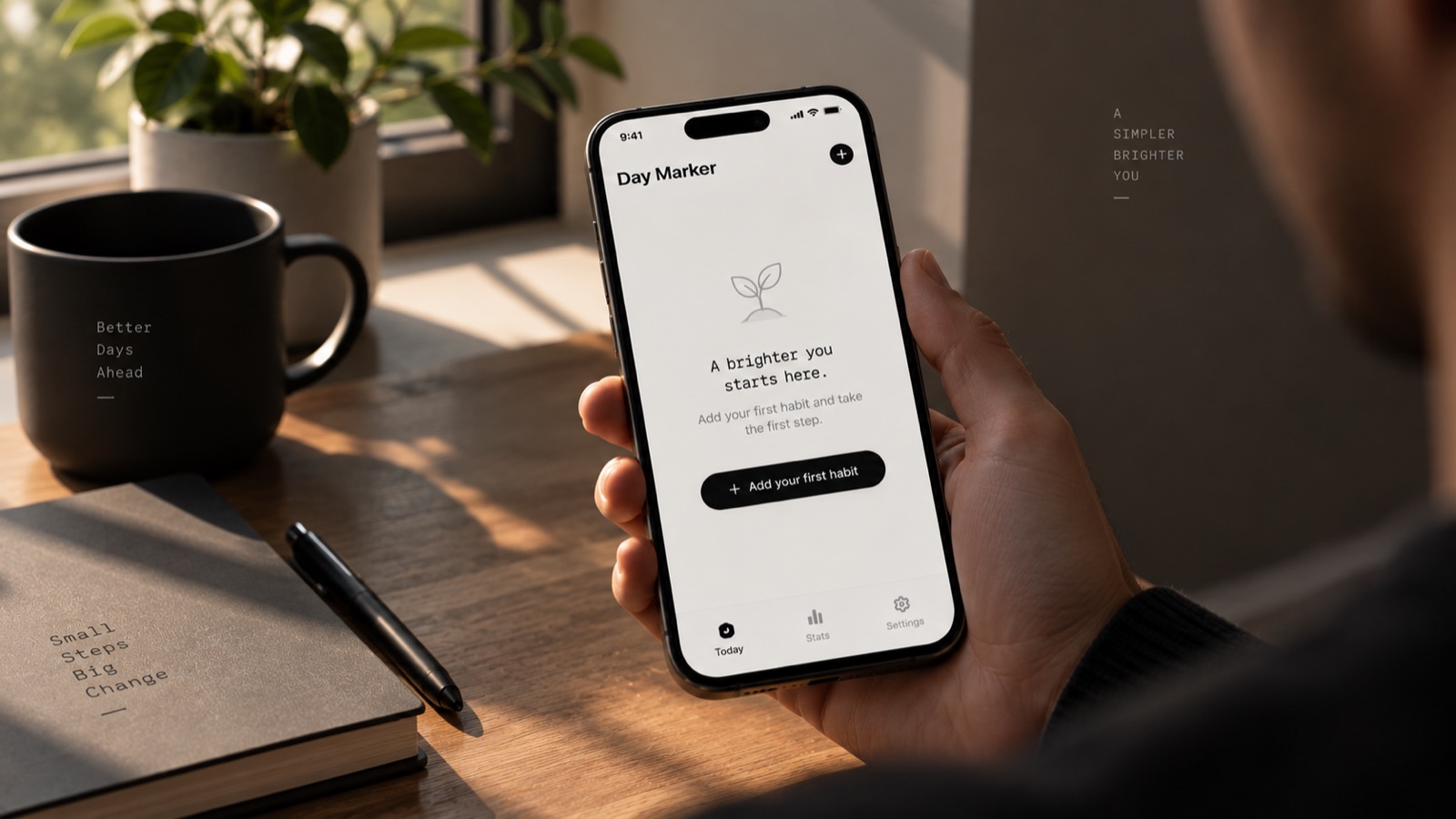
Designers often think about the interface once data exists.
But the first experience of an app happens before the user has anything.
No habits.
No history.
No streaks.
No statistics.
No achievements.
Just an empty screen.
That empty screen has a job.
It needs to answer:
"What do I do now?"
For Day Marker, this became particularly important because the product is fundamentally about building a personal system.
The first few minutes determine whether the user understands the philosophy of the app.
Instead of throwing a complicated setup process at them, the experience should gently lead them toward adding the first thing they want to remember.
Not ten habits.
Not a perfect morning routine.
Just one.
Because one is enough to begin.
5. Good UX often means resisting perfectly reasonable ideas
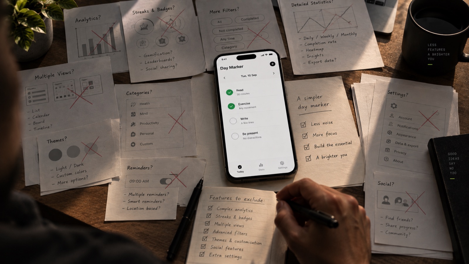
This was perhaps the most painful lesson.
While designing Day Marker, there were many features that made perfect sense.
More analytics.
More customization.
More views.
More ways to organize things.
More information.
And each one was defensible.
That's what makes product design difficult.
Almost every feature can be justified.
The question isn't:
"Is this useful?"
The better question is:
"Is this useful enough to deserve its place here?"
That small change in thinking makes a huge difference.
A feature doesn't compete only with development time.
It competes with the user's attention.
Every new control adds another decision.
Every new screen adds another place to go.
Every new option increases cognitive load.
So sometimes the best design decision is deleting something you spent hours designing.
That's not wasted work.
The exploration was necessary to discover that the feature didn't belong.
6. Consistency matters more than decoration
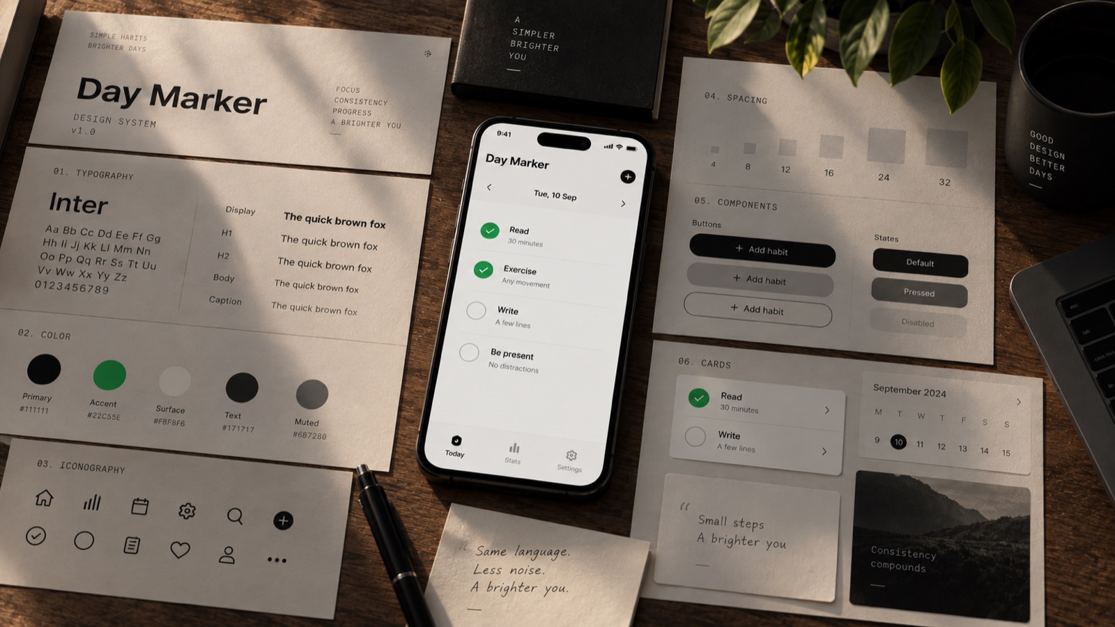
When you work on a product for long enough, you start noticing tiny inconsistencies.
A button is two pixels taller here.
A corner radius is slightly different there.
One screen uses a different spacing value.
One icon doesn't quite align with the others.
Individually, none of these things matter.
Together, they make a product feel unfinished.
Day Marker reminded me that visual quality rarely comes from one spectacular component.
It comes from hundreds of small decisions agreeing with each other.
Typography.
Spacing.
Corner radii.
Iconography.
Motion.
Color.
Interaction states.
Empty states.
Error states.
Loading states.
Everything needs to speak the same language.
A design system isn't just a collection of reusable components.
It is a product's visual grammar.
7. Designing mobile interfaces means designing for interruptions
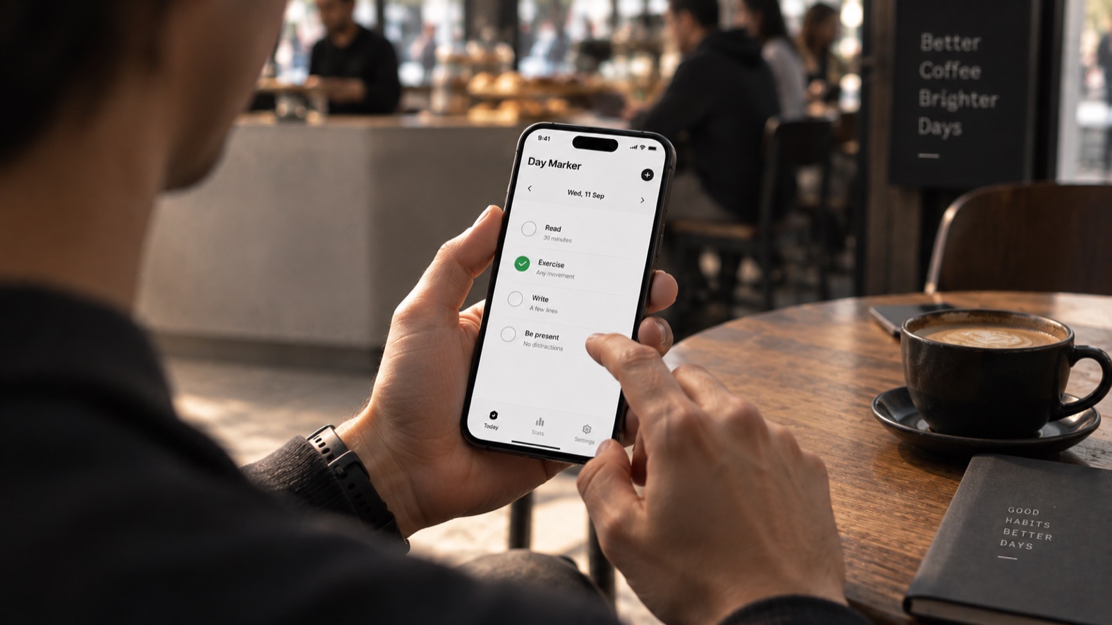
One thing that is easy to forget while designing on a desktop is that mobile users rarely give you their full attention.
They might be walking.
Waiting for coffee.
Standing in a queue.
Half asleep.
Checking their phone between two other things.
Someone might open Day Marker for five seconds, mark something complete, and leave.
That changes what "good UX" means.
The interface needs to work when attention is scarce.
Large enough targets.
Clear hierarchy.
Immediate feedback.
Minimal navigation.
No unnecessary confirmation dialogs.
No interaction that requires remembering something from the previous screen.
The best mobile experience often isn't the one with the most polished animation.
It's the one that lets the user finish what they came to do before they lose interest.
8. The interface should respect the user's time
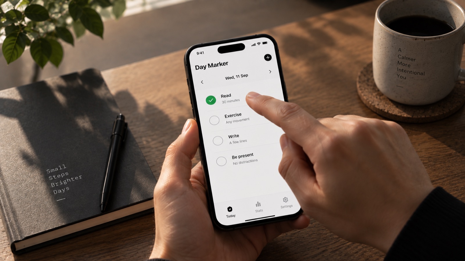
This sounds like a small principle, but it became one of the strongest ones for me.
Every tap has a cost.
Every animation has a cost.
Every screen transition has a cost.
Every piece of text has a cost.
Every decision has a cost.
None of these costs are necessarily bad.
But they should be justified.
If the user has already told the app something, don't ask again.
If something can be understood visually, don't explain it with a paragraph.
If an action is reversible, don't interrupt the user with a confirmation dialog.
If a screen can be simplified, simplify it.
The goal isn't to make the user spend more time inside the app.
The goal is to help them accomplish what they came for.
A successful productivity app should sometimes make itself unnecessary.
9. Real products are messier than design files
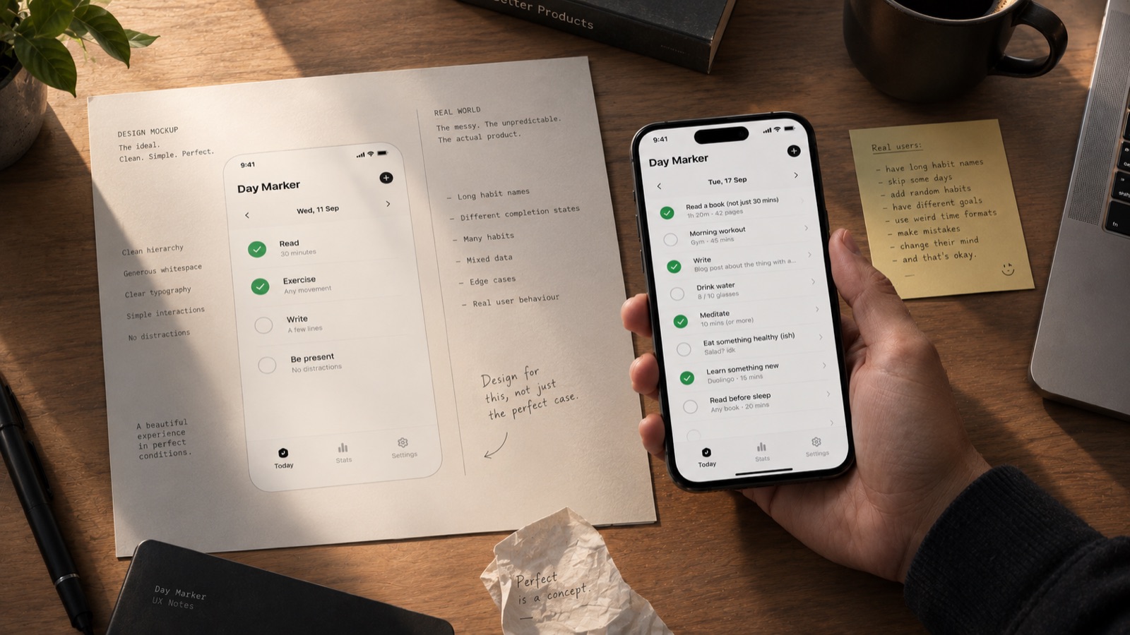
One of the biggest differences between designing screens and designing a product is that screens behave perfectly in design tools.
Real products don't.
People enter unexpected data.
They create unusual combinations.
They skip steps.
They change their minds.
They use the app differently from what you imagined.
They come back after three months.
They have a hundred items.
They have one item.
They have no items.
They use small screens.
They use large screens.
They have notifications disabled.
They don't read instructions.
They tap things you never expected them to tap.
This is where UX becomes real.
A beautiful design that works only in the happy path isn't really finished.
The edge cases are part of the experience.
10. You have to design for the person who doesn't think like you
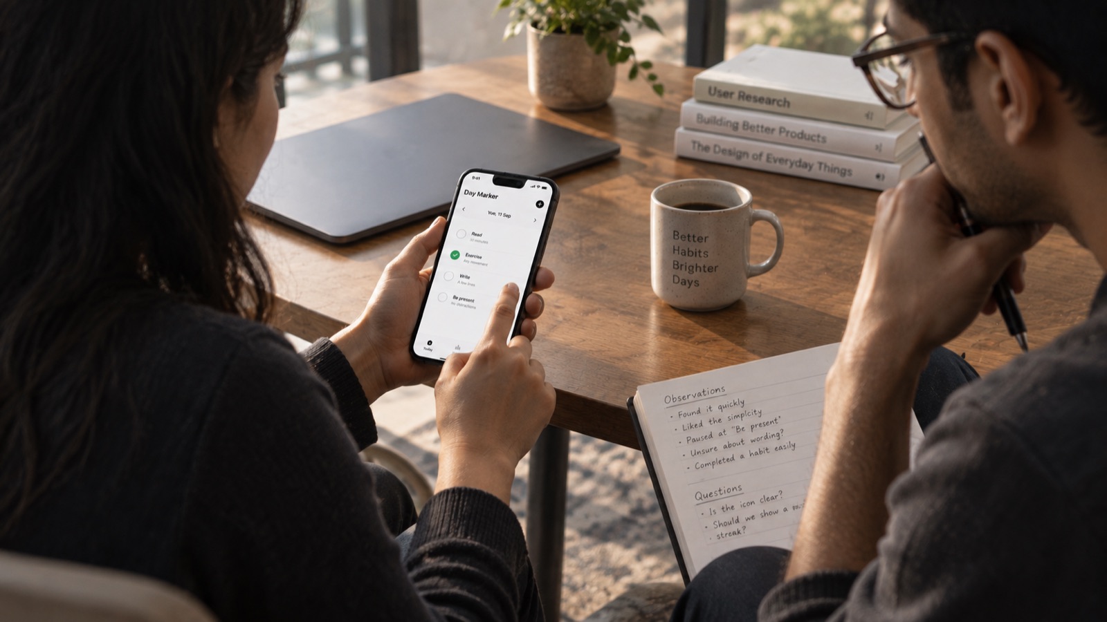
When you're designing your own product, this is especially difficult.
You know how everything works.
You know why a particular button is there.
You know what a particular icon means.
You know what the product is supposed to do.
The user doesn't.
That's why designing for yourself can be dangerous.
You unconsciously fill in gaps.
You see intention where the user sees ambiguity.
One of the best questions I learned to ask was:
"If I didn't build this, would I know what to do?"
If the answer is no, the design isn't finished.
11. Sometimes the best product decision is philosophical
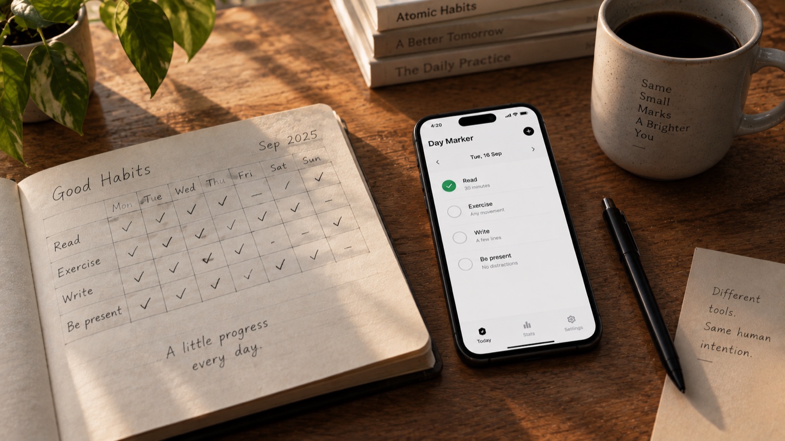
This is perhaps the strangest lesson Day Marker gave me.
At first, I thought I was designing a habit tracker.
Eventually, I realized I was designing an opinion about habits.
There are thousands of ways to build a habit product.
Some emphasize streaks.
Some emphasize productivity.
Some emphasize statistics.
Some emphasize gamification.
Some try to turn your life into a dashboard.
Day Marker doesn't need to win every one of those battles.
It only needs to have a point of view.
For me, that point of view became increasingly simple:
Your life is made of days.
Not streaks.
Not charts.
Not percentages.
Days.
You wake up.
You do the things that matter.
You mark them.
Then tomorrow comes.
There is something old-fashioned about that idea.
And perhaps that's why I like it.
Before apps, dashboards and productivity systems, people simply kept calendars, notebooks and marks on paper.
A small mark could mean:
I did this today.
Day Marker is, in a way, a modern interpretation of that very old habit.
12. The biggest lesson: simple doesn't mean easy
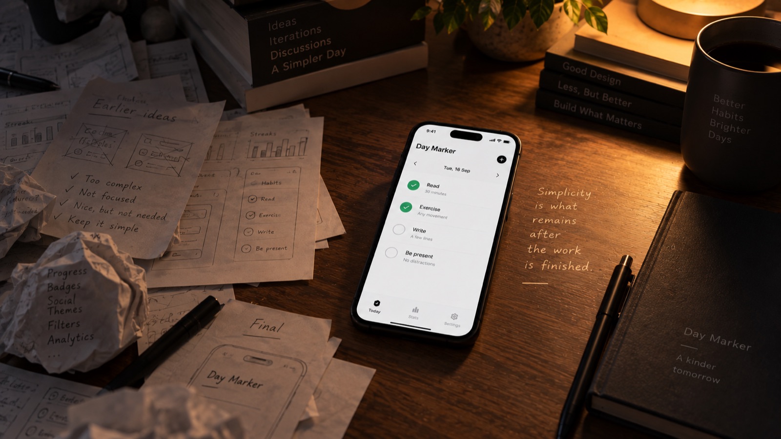
This is probably what I'll remember most from building Day Marker.
It's easy to make something complicated.
Complexity gives you somewhere to hide.
There is always another setting you can add.
Another screen.
Another metric.
Another feature.
Another explanation.
Simplicity leaves nowhere to hide.
When there are only a few things on the screen, every decision becomes visible.
The typography matters.
The spacing matters.
The wording matters.
The interaction matters.
The empty state matters.
The smallest detail becomes part of the experience.
That's why simple products can take an enormous amount of work.
You aren't designing less.
You're deciding more carefully what deserves to remain.
What Day Marker changed in the way I design
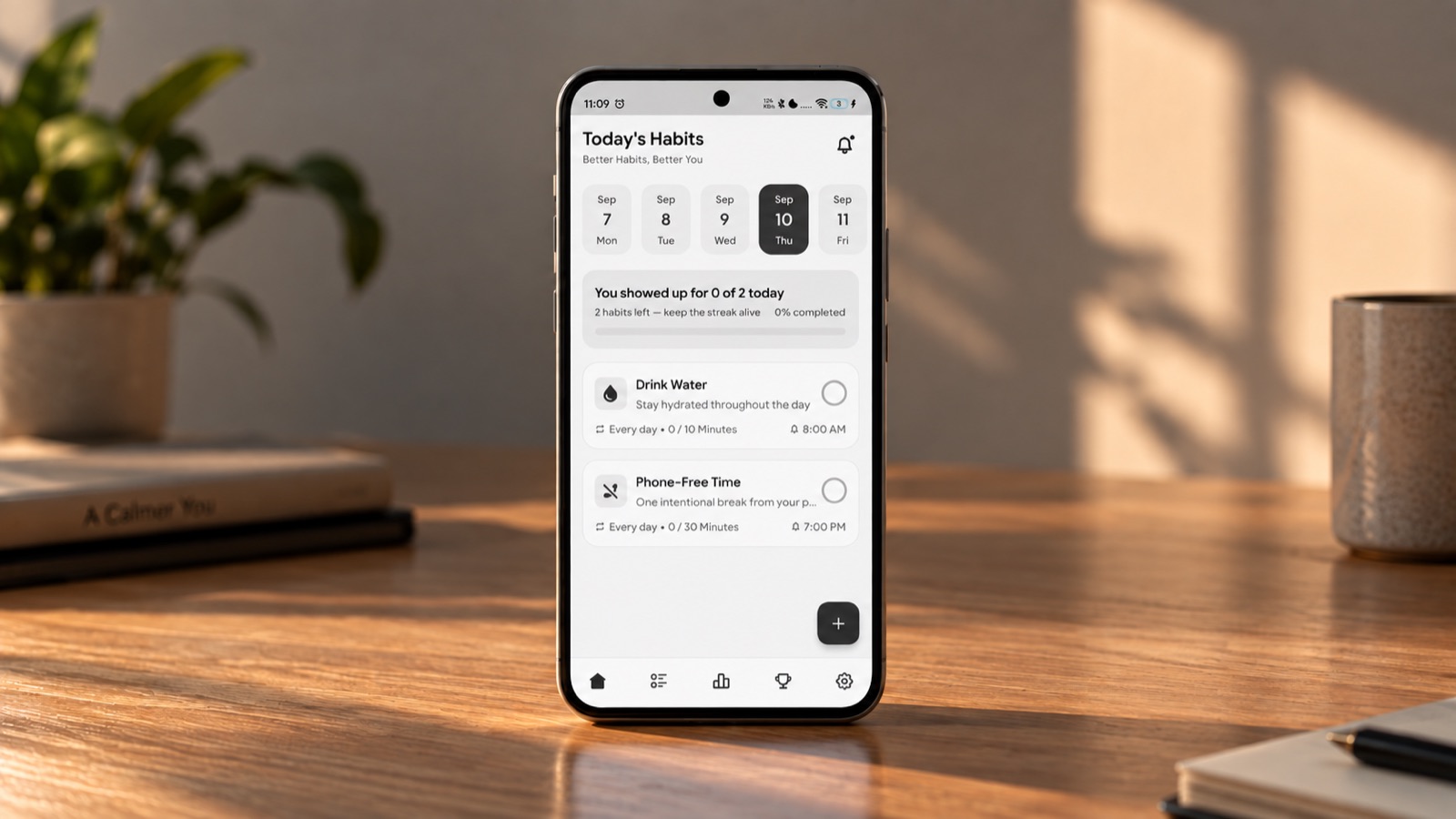
Before Day Marker, I probably thought more about what an interface could do.
After Day Marker, I think more about what an interface should leave out.
I think about the user's attention differently.
I think about emotional consequences, not just usability.
I think about whether a feature earns its complexity.
I think about whether an interaction respects someone's time.
And perhaps most importantly, I think about whether the product has a reason to exist beyond its list of features.
Because ultimately, good product design isn't about making software impressive.
It's about making something feel inevitable.
As if, once you've used it, you wonder:
"Why wasn't it always this simple?"
That is the kind of design I'm trying to make.
And Day Marker has been a very good teacher.
Related Project
Daymarker
Mortuz Alam
Software engineer & product builder. More about me ->